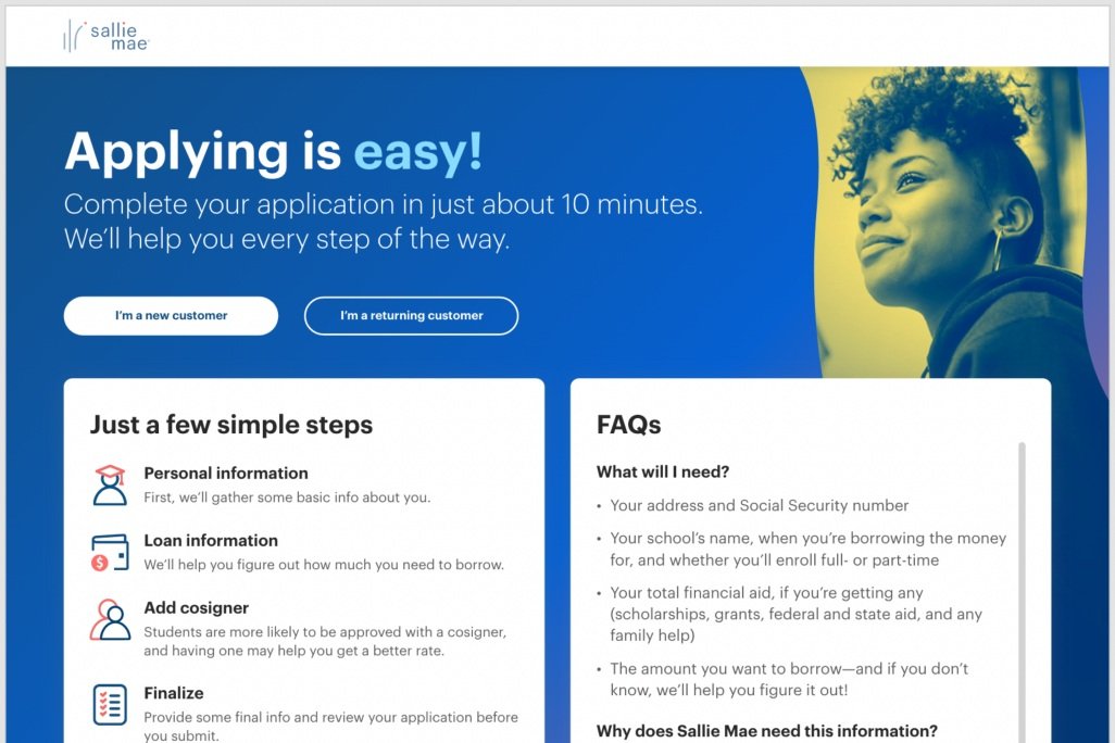
Redesign with a focus on engagement.
How to help solve for a 64% drop off rate for the business with a landing page redesign to increase pull thru rate by providing a better user experience.
Where it all started: overwhelmed
Where it won: simplicity
4 weeks to concept, design, test, develop & publish.
Based on a hypothesis of: Providing clear language and context on what customers are applying for. Creating button clarity: make them action-oriented. Position guided content and FAQs as secondary.
-
This time was spend exploring 3 concepts to solve the major pain points outlined above. The brand had evolved since the previous design was made, so we also needed to adjust style to align with the new branding guidelines.
-
Move forward with chosen concept into A/B testing and validation. We tested two styles of on page navigation, one with text labels and one with icons from the original concept.
Research Goals:
To see how confident users are to move forward with the application process. We wanted to learn about peoples’ expectations about the very start of the online student loan application process. Including:
What they expect to see / learn
What would make them progress / abandon
Interactions with the navigation
Methodology
Conducted 2 sets of unmoderated user testing on Usertesting.com.
1. Undercurrent with Icons Desktop
2. Undercurrent with Text DesktopConducted 2 sets of moderated tests.
1. Undercurrent 2.0 Desktop
2. Undercurrent 2.0 MobileAudience
Unmoderated:
• 20 users total (5 borrowers and 5 cosigners per test.)
• College students who currently fund their schooling through Private Student Loans.
• Cosigners who fund borrowers through PSL.
• Based in the United States.Moderated:
• 16 users total (8 new customers and 8 serial borrowers)
• College students who currently fund their schooling through Private Student Loans.
• Based in the United States.Insights
Users appreciated the simplicity and clearness of the page.
It was clear to users what action they need to take to move into the application.
Most users who read the "10 minutes" line positively received how quick the application would take.
Users didn't know they could interact with the icons, they moved right into the application instead. However, when replaced with text, some users clicked on the CTAs and interacted with the content.
Users who interacted with the rail had trouble understand what REQs meant, but when clicking on it stated that having requirements listed was helpful
-
The next stage of development was to implement insights from user testing and connect with risk partners on final design.
Text was the user favorite, and hover animations made it more intuitive for the them navigate the experience.
The purple video was replaced with blue which has a stronger association with trust.

